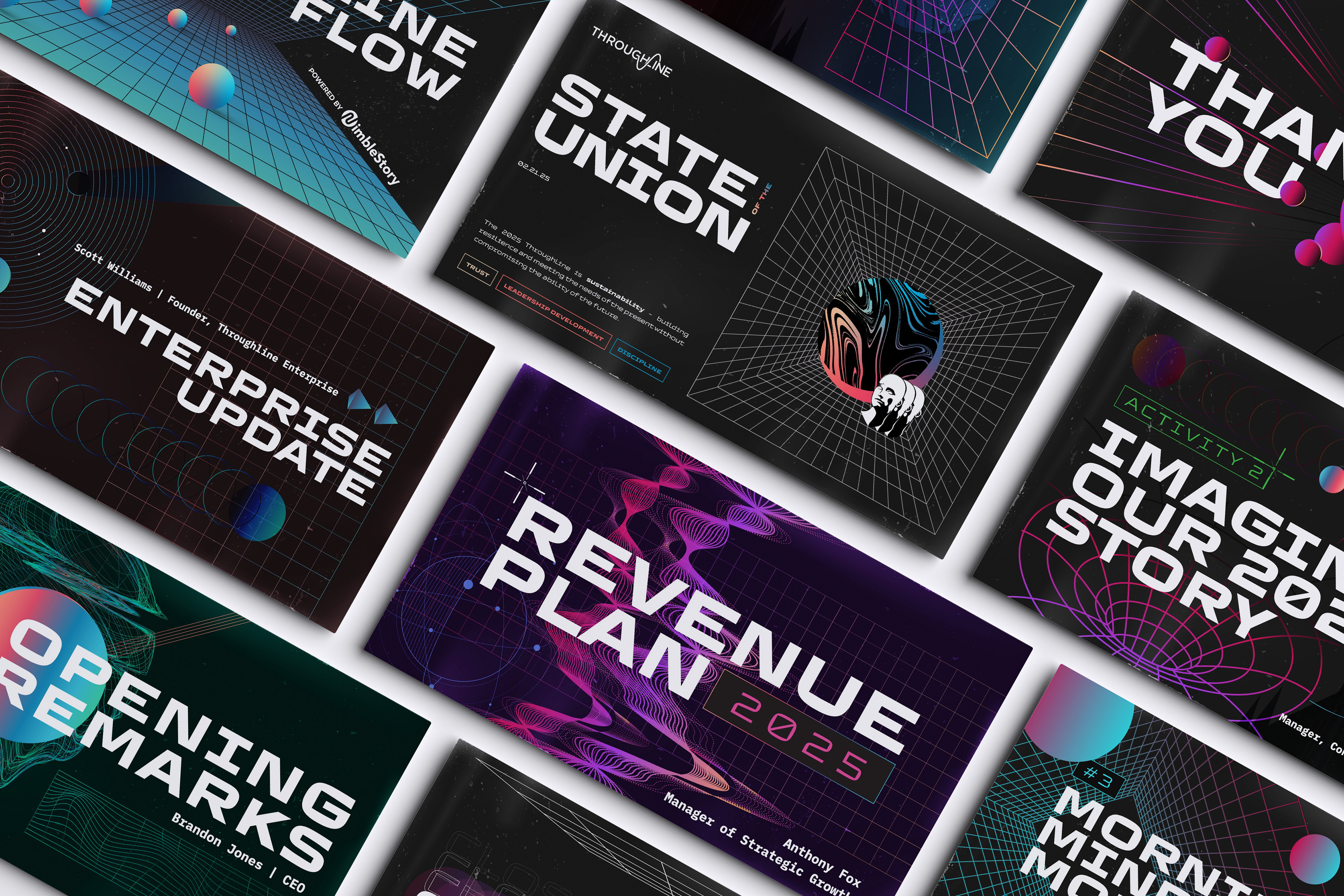
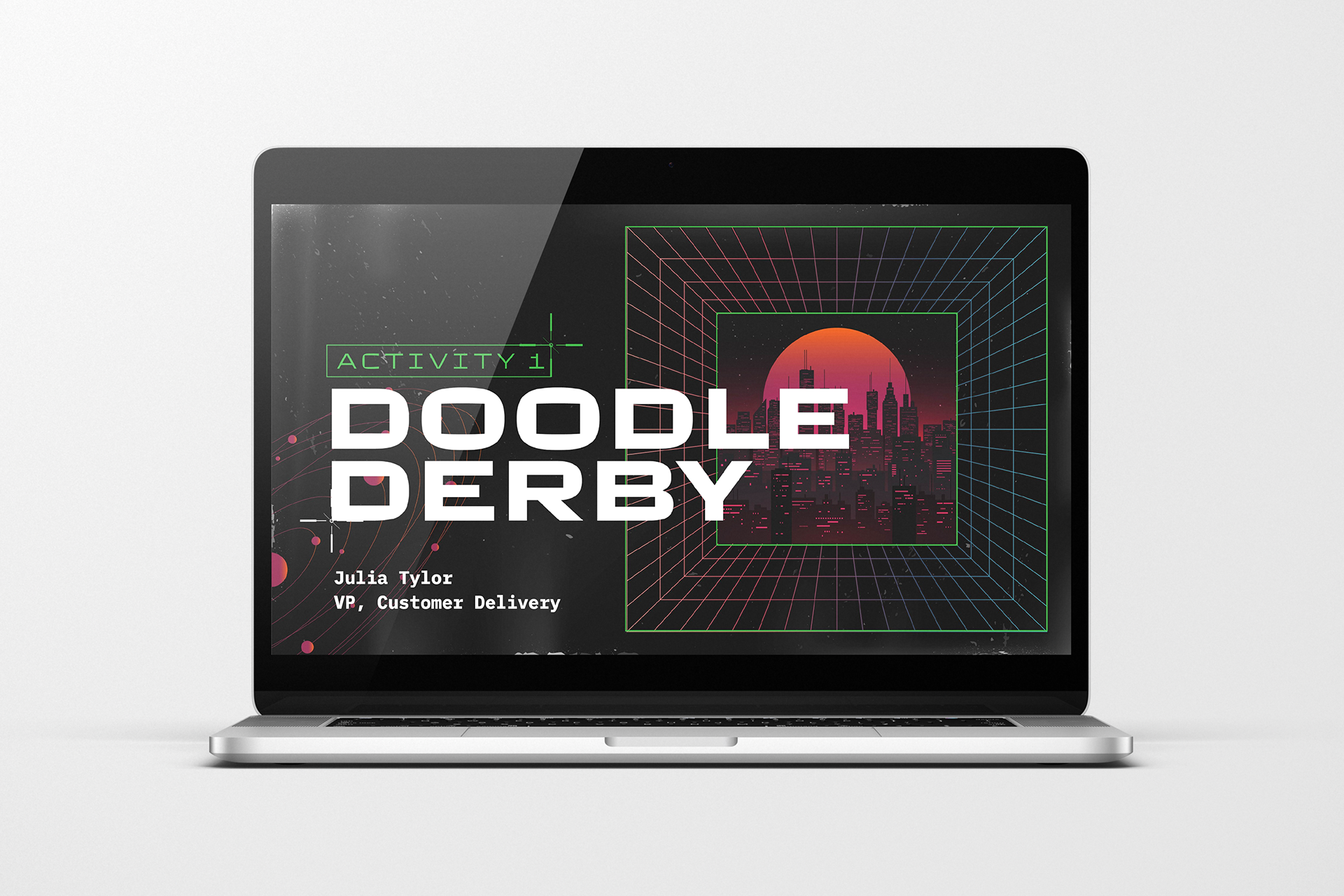
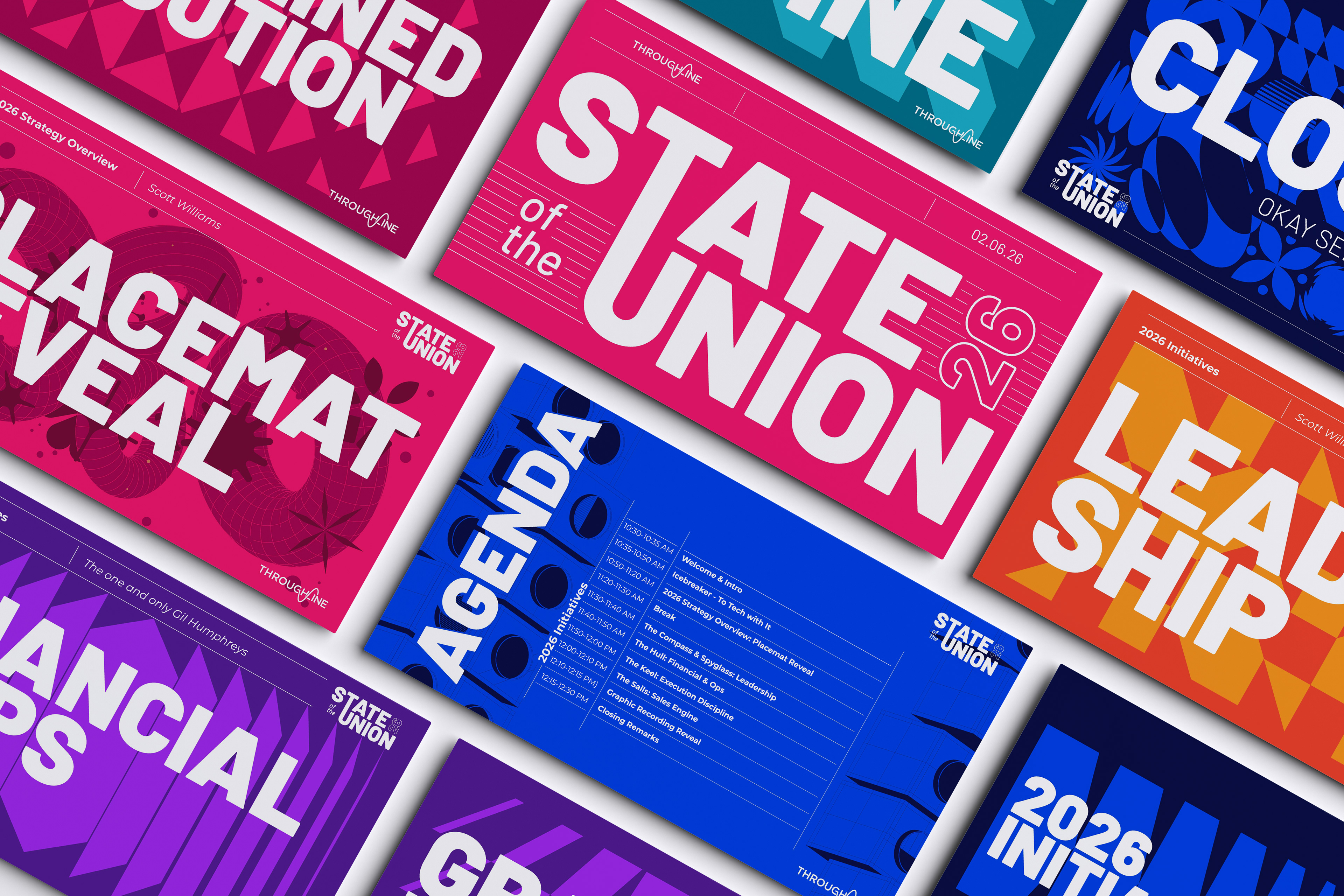
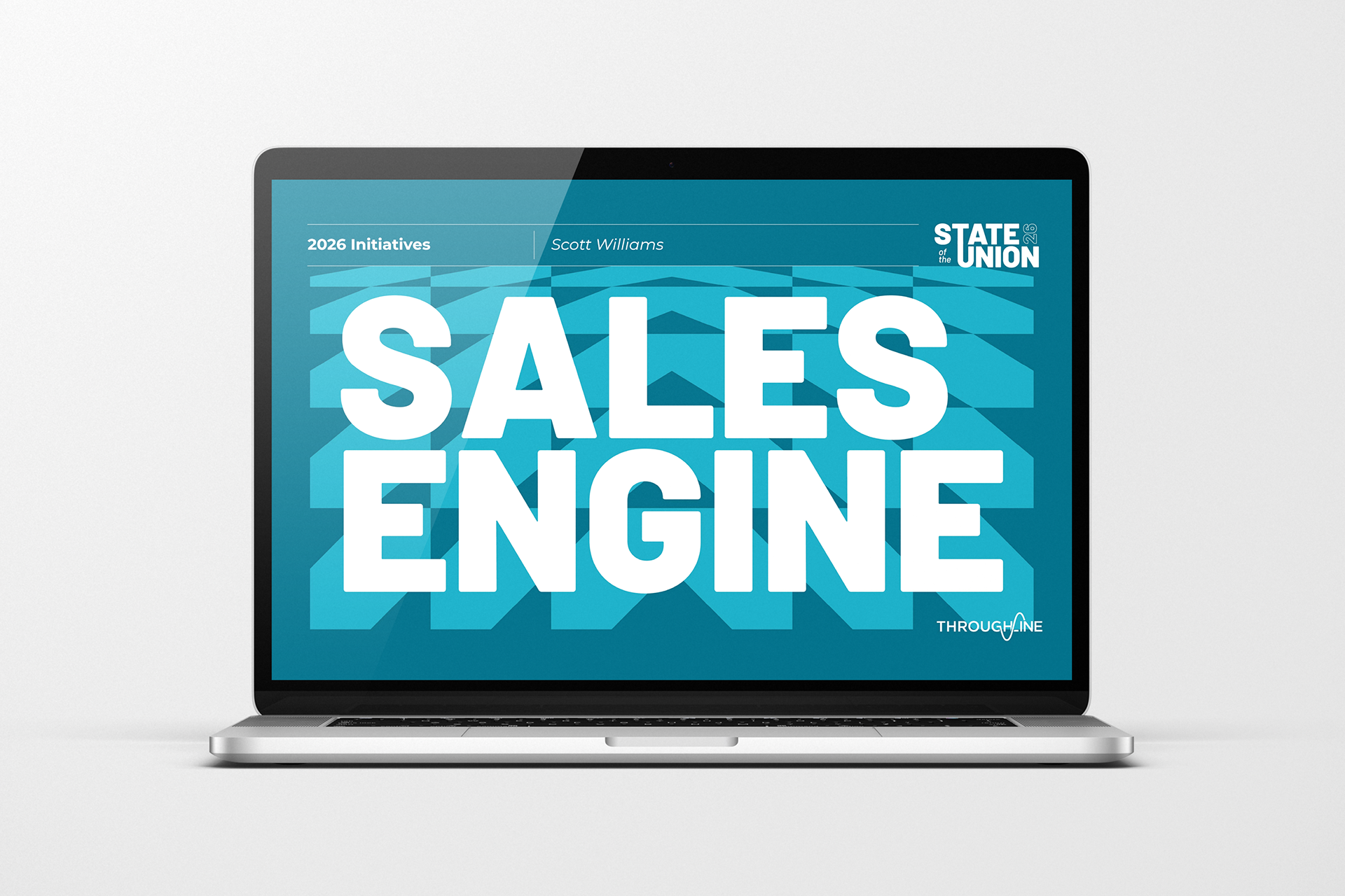
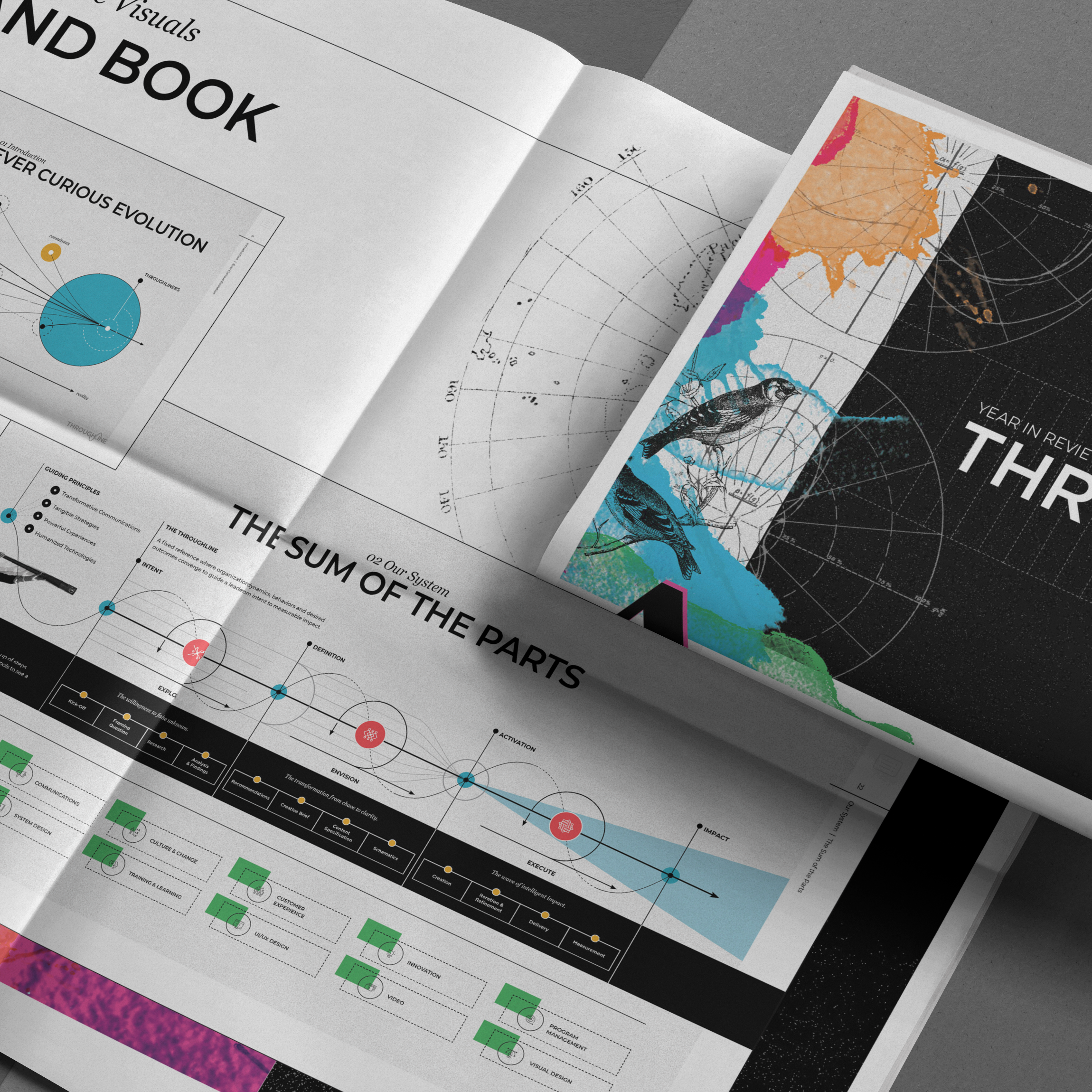
Every year, Throughline takes a day to look ahead, to share the state of the company, introduce the goals and priorities for the year ahead, and reveal the new strategic placemat. I developed the visual direction for the 2025 and 2026 SOTU experiences, creating distinct identities that gave each year its own energy and personality.
In 2025, I drew inspiration from a visit to Meow Wolf in Denver, channeling its gritty, cyberpunk, futuristic aesthetic into a visual world of dark fields, digital grids, neon color, and surreal forms (you see some of the inspo also in the Creative Sync project). The result was intentionally immersive, giving the presentations an edge and creating a visual language that could keep evolving throughout an all-day event.
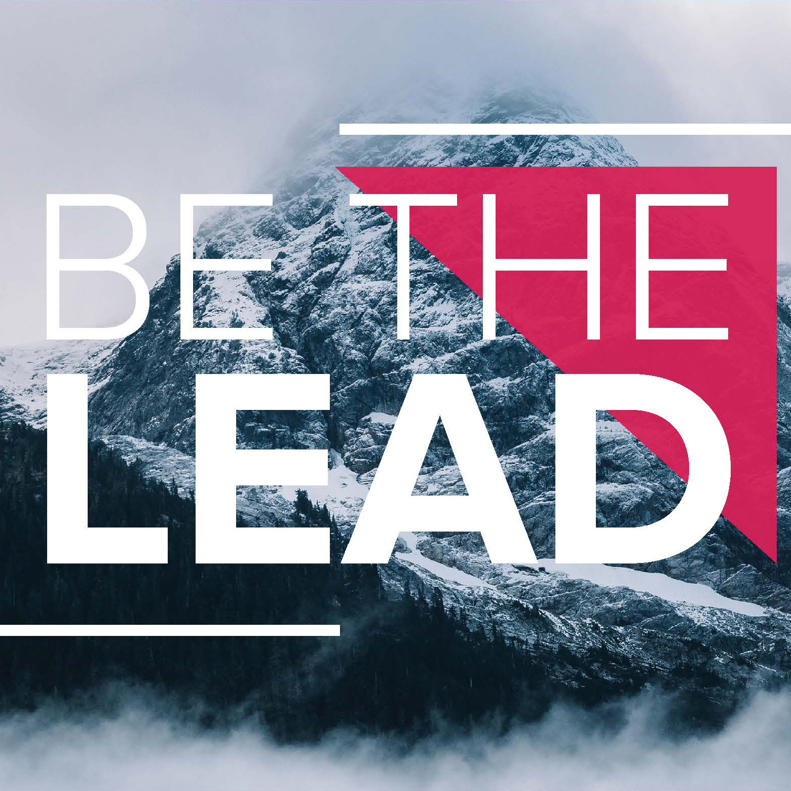
For 2026, I took a completely different approach, leaning into bold color, oversized typography, playful geometry, and graphic shapes. The brighter, more expressive system brought a sense of optimism and momentum to the experience.
Because SOTU is an all-day event, the visual system has to do more than establish a look. It needs to keep the audience engaged from the opening slide through the final session, while creating a sense of anticipation around what’s next. The goal is to build hype around the year ahead and leave the team energized about where Throughline is going.